Desing Solution
Restricted Products Experience
Restricted Products Experience
Simplifying product restrictions to improve user understanding
Simplifying product restrictions to improve user understanding
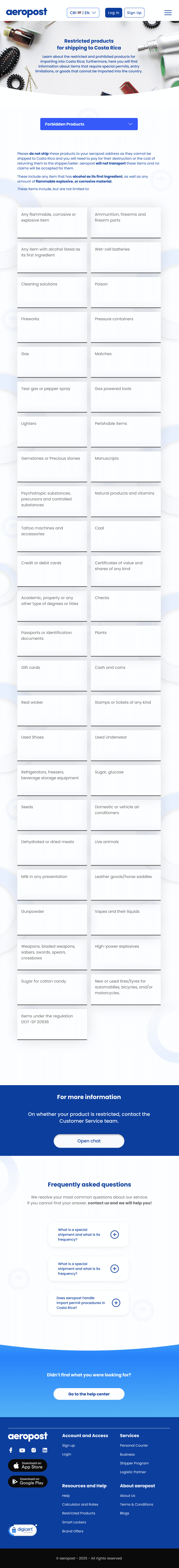
The restricted products section lacked clarity, making it difficult for users to understand what could or couldn’t be shipped.
The goal was to simplify the information and make restrictions easier to understand.
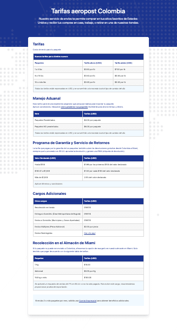
Aeropost’s shipping experience required users to both estimate costs and understand pricing structures. The challenge was to simplify the entire pricing experience, making it clearer, more transparent, and easier to use.
Aeropost’s shipping experience required users to both estimate costs and understand pricing structures.
The challenge was to simplify the entire pricing experience, making it clearer, more transparent, and easier to use.
Designing pricing experiences is not just about numbers, but about clarity and trust.
Simplifying how users understand costs can significantly improve decision-making.
What I learned
View prototype
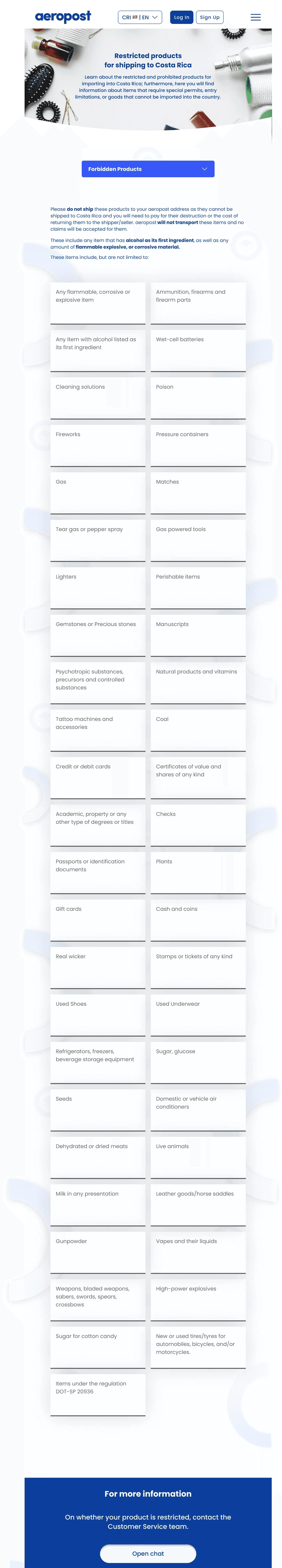
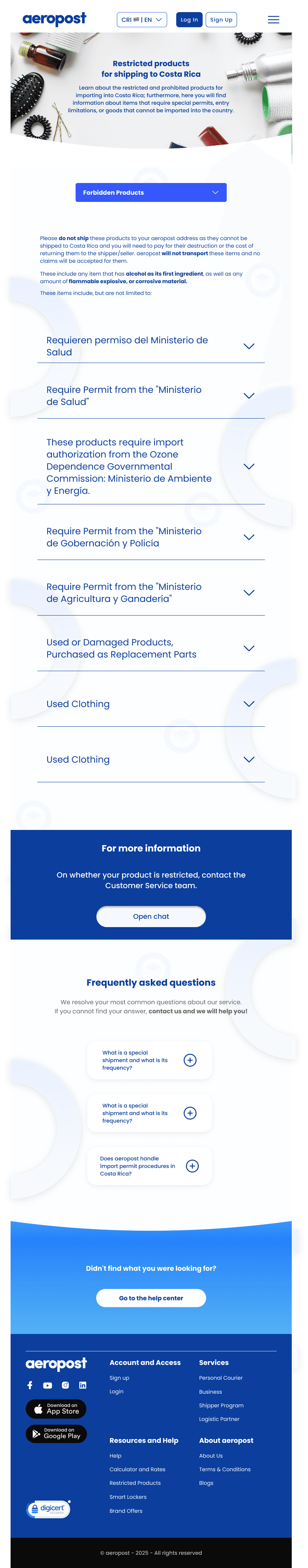
Better understanding
Users quickly identify restricted products.
Better understanding
Users quickly identify restricted products.
Better understanding
Users quickly identify restricted products.
Impact
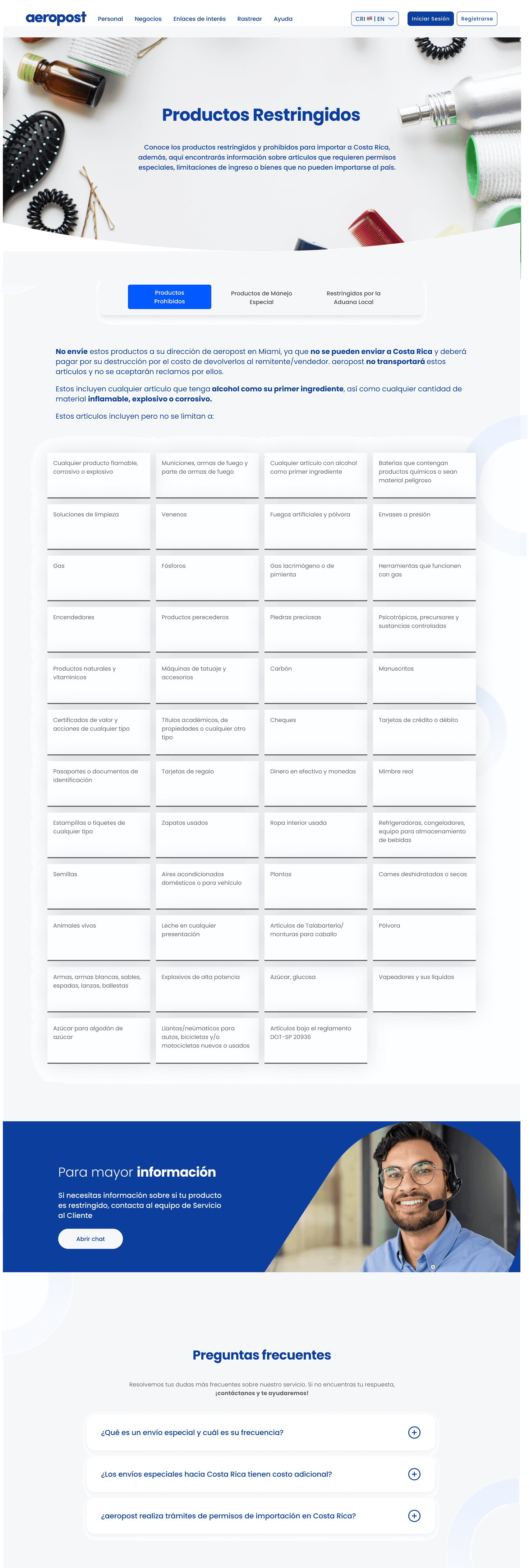
After
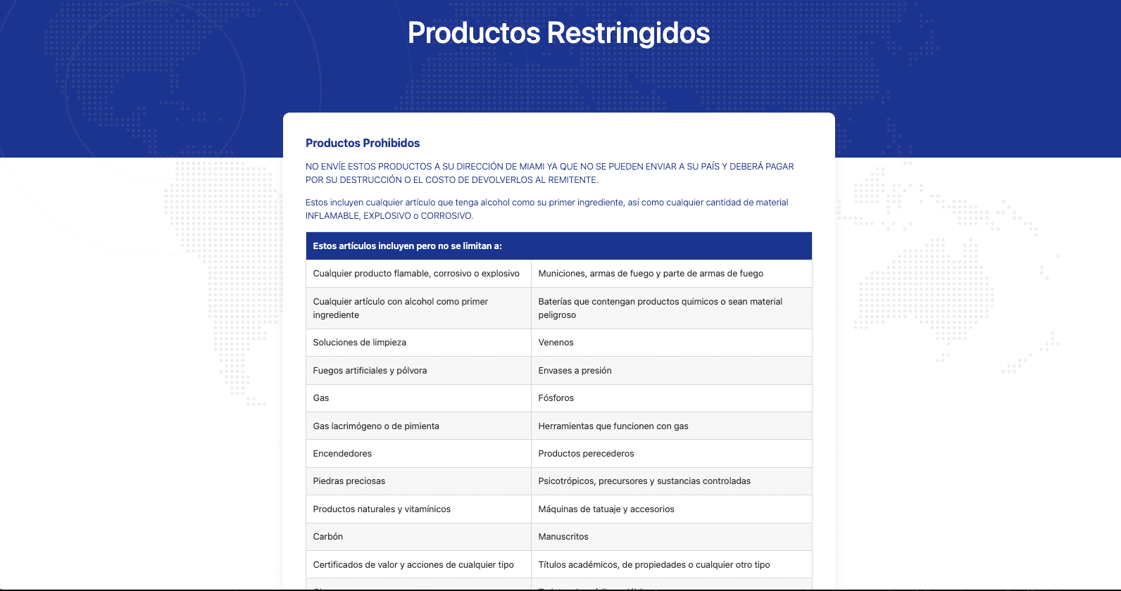
Before
From confusion to clarity
The solution focused on simplifying content, improving structure, and making restrictions easier to understand.
Desing Solution
The Challenge
Understanding the problem
Users struggled to understand product restrictions due to unclear information and lack of structure.
Unclear restricted
Hidden fees and unclear totals
Confusing information structure
Confusing information structure
Lack of visual guidance
Lack of visual guidance
Low user confidence
Low user confidence
Impact
After
Before
Desing Solution
From confusion to clarity
The solution focused on simplifying content, improving structure, and making restrictions easier to understand.
Better understanding
Users quickly identify restricted products.
Better understanding
Users quickly identify restricted products.
Better understanding
Users quickly identify restricted products.
Designing pricing experiences is not just about numbers, but about clarity and trust.
Simplifying how users understand costs can significantly improve decision-making.
What I learned
After
What I learned
Designing pricing experiences is not just about numbers, but about clarity and trust. Simplifying how users understand costs can significantly improve decision-making.
Before
From confusion to clarity
Pricing information was unclear and difficult to understand.
The new structure presents costs in a more transparent and organized way.
Pricing
The solution focused on simplifying content, improving structure, and making restrictions easier to understand.
Desing Solution
From confusion to clarity
After
Before
Impact
The Challenge
Users struggled to understand shipping costs due to a fragmented pricing experience between the calculator and pricing information.
Understanding the problem
The Challenge
Understanding the problem
Users struggled to understand product restrictions due to unclear information and lack of structure.
Users struggled to understand product restrictions due to unclear information and lack of structure.
The Challenge
Understanding the problem